1991precision within
every structure
Precision,made visible.
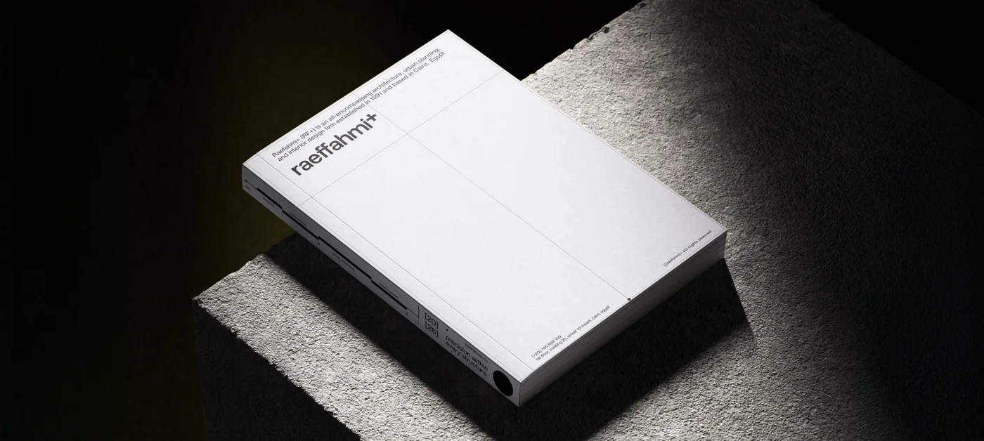
A visual identity built around light and shadow, solid and void. Every element has a role in the composition.
CAIRO, EGYPTESTABLISHED 1991

The acute angle in the “f” and “+” gives negative space a defining role. The original artwork is preserved, with clear space around each mark.
Concrete, Stone and Graphite form the foundation. Brick is a restrained 10% accent. The four discipline colours are reserved for the scale.
From the intimate
to the urban.

This is an identity graphic, not a timeline. Its four colours identify Interior, Construction, Urban planning and Architecture; the digits together read 1991, the year the practice was established. The original scale is preserved here. Everyday navigation uses the primary palette and clear discipline names.
Freedom within
a structure.
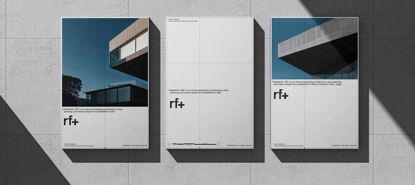
A flexible grid aligns type, imagery and information. The frame, adaptable plus, line, box and sphere provide the visual vocabulary.